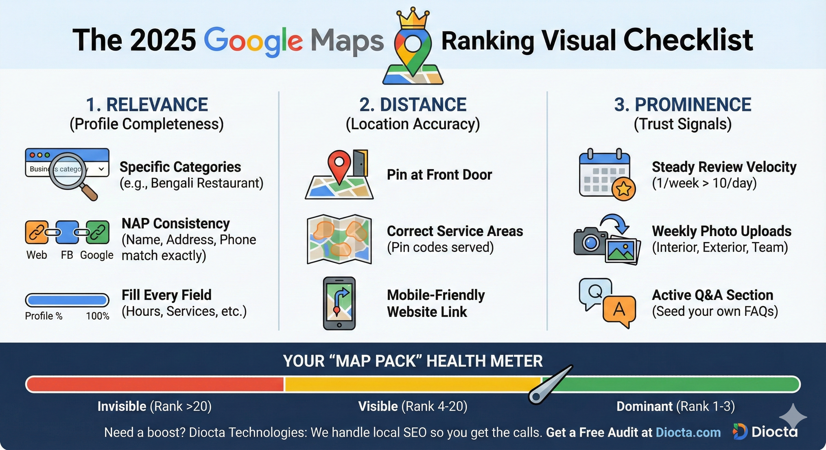
Is Your Website Losing You Money? The 5-Point "Sales Engine" Test for SMBs.
Bapi Diocta | 4 min Read |Marketing
Does your website convert visitors into customers, or do they just leave? Take our free 5-point DIY audit to find the hidden flaws killing your sales.
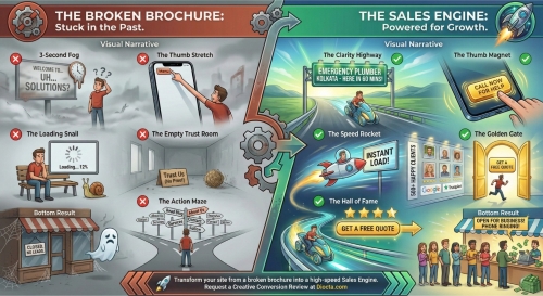
The "Brochure" Problem
If you are driving traffic to your website but seeing zero leads, you aren't alone. Many small businesses are unknowingly operating with a "Broken Brochure" model. These websites function like static, digital business cards: they provide information, but they don't compel action. They are "stuck in the past," often confusing visitors and creating friction that drives potential customers to competitors.
To succeed in the modern digital landscape, you need to transform your site into a "Sales Engine"—a dynamic platform powered for growth that actively guides visitors toward a purchase.
How does your current site stack up? We’ve broken down the difference into five critical areas. Run your website through this DIY audit to see if you are building a "Clarity Highway" or getting lost in the "Action Maze."
1. The Clarity Audit: The 3-Second Rule
The Broken Brochure: Visitors encounter the "3-Second Fog." They land on a homepage with vague headlines like "Welcome to... UH... SOLUTIONS?". The messaging is generic, leaving the user confused about what the business actually offers.
The Sales Engine: The site builds a "Clarity Highway." The value proposition is immediate and specific. For example, instead of "Plumbing Solutions," the headline reads "EMERGENCY PLUMBER KOLKATA - HERE IN 60 MINS!". The visitor knows exactly what is being offered and the timeline for delivery.
DIY Check: Look at your homepage for 3 seconds. If a stranger cannot identify exactly what you sell and who it is for, rewrite your headline.2. The UX Audit: The Thumb Test
The Broken Brochure: Mobile users are forced into "The Thumb Stretch." Critical menus are hidden in hard-to-reach corners, and navigation requires awkward hand gymnastics.
The Sales Engine: The design utilizes "The Thumb Magnet." High-value buttons, such as "CALL NOW FOR HELP," are placed prominently within the natural thumb-scrolling zone. The interface is designed for the mobile user first, reducing physical friction.
DIY Check: Open your site on a smartphone. Can you tap your primary "Call" or "Buy" button easily with one hand?
3. The Performance Audit: Speed vs. Patience
The Broken Brochure: The site suffers from "The Loading Snail." Visitors are greeted by spinning wheels and "Loading... 12%" bars. In an on-demand economy, waiting is the fastest way to lose a sale.
The Sales Engine: The site rides "The Speed Rocket." Pages are optimized for "INSTANT LOAD!". Technical performance is prioritized to ensure that user interest doesn't wane before the content appears.
DIY Check: Run your URL through Google PageSpeed Insights. If you aren't in the green, your "loading snail" is costing you revenue.
4. The Credibility Audit: Building Trust
The Broken Brochure: The site is an "Empty Trust Room." It asks visitors to "Trust Us (No Proof)". With no evidence of past success, skeptical users are likely to bounce.
The Sales Engine: The site showcases a "Hall of Fame." It features a gallery of 500+ happy clients, faces of real people, and star ratings from trusted platforms like Google and Trustpilot. This social proof validates the visitor's decision to engage.
DIY Check: Do you have third-party reviews visible on your homepage? If not, move them "above the fold" immediately.
5. The Conversion Audit: The Path to Action
The Broken Brochure: Visitors are trapped in "The Action Maze." They are bombarded with too many choices: Read Blog, About Us, Services, Contact, Follow. When faced with too many options, users often choose none.
The Sales Engine: The site leads to "The Golden Gate." Distractions are stripped away to focus on a single, clear objective, such as "GET A FREE QUOTE". The path to conversion is linear and unmistakable.
DIY Check: Count the number of links on your landing page. If there are more than two distinct goals, simplify the page to focus on one primary conversion.
The Bottom Line
The difference between these two models is stark. The Broken Brochure results in a closed storefront with "No Leads," while the Sales Engine results in a ringing phone and a business that is "Open for Business".
Ready to stop losing money? Transform your site from a broken brochure into a high-speed Sales Engine. Request a Creative Conversion Review today at Diocta.com.


Share Now: